February 11, 2016
Every page on a website serve a purpose, so all the pages are important. But some of the pages comprises more importance as compared to others. These pages are known as the most visited pages of a website.
Every website has a different outline, but if we talk about the foremost pages of a website then – Home Page, About Page, Contact Page leads the list. In this composition, we are going to discuss, how to upgrade these pages, as they are the most visited pages, thus is very essential to perform the up-gradations process for them. Let’s learn more about these pages:
Home Page
When users type URL directly on the address bar, then they will be directed to the Home page of a website. It is the first page that visitors see. We can say that Home page leaves the first impression for their visitors. If the home page’s outline impresses the visitors, then will definitely click on other pages to explore, which will result in improved conversion rates. The key factors for the best home page include simple design with attractive headlines, informative sections, clean navigation and contact us link.
About Page
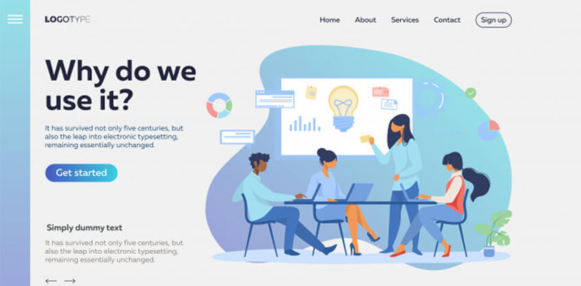
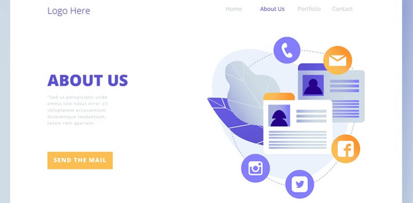
This page is also referred as About us page, which provides complete information about the organization’s history and what they are doing. When it comes to best solutions for About us page, then it is required to frame the text in a manner which enables the user to stay a while. Give all the major answers in the beginning and be more detailed about the organization’s practices. Make it a conversational information for the user.
Contact Page
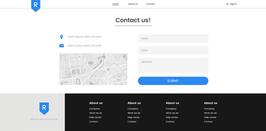
The visitors seek for this page, to get contact information of the company. It encloses the information like mailing address, phone number, address, fax number and social media links. Nowadays, most of the website owners includes a map to the address on the contact page, while also provides a section for the user to have a conversation with the owner.
What should be the goal for the user?
Now, here the point comes, the most important goal should be CTA (Call-to-action), or you need to ask the visitor to do something. All of the above pages are not meant to just look and leave. Every single page of a website should contain at least one CTA.
We just want to say that, only knowledge is not at all enough for the user. To have an application for that knowledge and the user response will lead to having better user engagement while result in improvised user marketing.
Let’s go through some tips for upgrading the pages:
Home Page
Place the major information at front and center and use a simple & big headline.
Show flowing information and direct the user, that what next he is supposed to do.
The home page comprises lots of CTAs. Make all CTAs easy for the user to click and explore the website.
About Us Page
The visitor comes to this page for a reason, thus, provide important but relevant information in this section.
Do not forget to add at least one CTA, as the user do not visit the page just for information, they love to explore deeply.
Contact Page
Place all the required information for users.
Use “chat with us” or “mail us” as CTA on this page.
In conclusion, upgrading the foremost pages of a website is all about finding out what visitors are looking for, providing what they want, and enabling them to make an action in return.
In cities like San Francisco and St Louis, most the company owners upgrade about, home and contact pages by taking help from the professional SEO firms. You can also connect with the top SEO companies while searching the web. For example, use the phrase San Francisco SEO Company or St Louis SEO Company over the internet, and you will be provided with a list of professional SEO agencies.
Some Examples to Help You
Home Page
About Us Page
Contact Page

Recent Posts
ARE YOU A LEADING SEO SERVICE PROVIDER?
Get listed in world's largest SEO directory today!
Directory listing counter is continuously increasing, be a part of it to gain the advantages, 10194 Companies are already listed.


